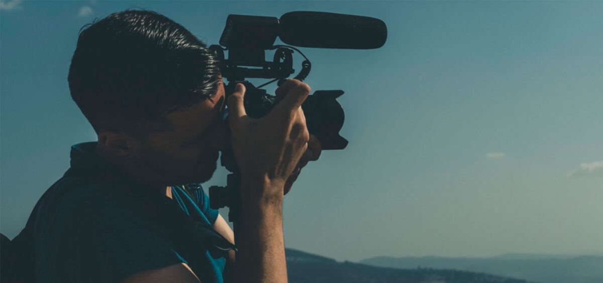
You may have hired a professional photographer or have a volunteer taking some snapshots for your website. Either way, it’s important for you to communicate the style and type of photos you need.
Photography can make or break the look and feel of your website. Make the best first impression with your photos by using these four easy steps.
4 Steps to Capture the Best Website Photos
1. Create a Shot List
Give your photographer a shot list prior to the photo shoot. Use your website sitemap to determine the types of photos you’ll need for each page. A safe estimate is 3-4 photos per page.
2. Capture Some Personality
Personalize your website by capturing events, services, staff and more. Find reference images to share with your photographer so they know what you have in mind for tone, style, lighting etc.
3. Choose Your Focal Point
Focus your photo on a subject that is centered or close to center. Images will be cropped for various screen sizes so keep important details off the edges and avoid closeups where the subject could be cropped awkwardly.
4. Check the Orientation
Landscape photos work best for website images. 16:9 ratios are most common.
Stay organized while building your photography archive.
Whether you’re starting from scratch or adding to an existing archive, keep it organized. This will be a major time-saver in the long run for your admin or website design team.
You’ll never regret taking the time to label folders and name images ahead of time so your archive is easy-to-use.


