

Making your museum website accessible is one of the most important things you can do with your site to better serve all communities. Just like your museum building should be accessible for all visitors, your website should be as well.
You can find a full outline of detailed, technical guidelines for website accessibility, called the Web Content Accessibility Guidelines (WCAG) 2.1. The guide is organized around 4 principles of accessible website design — perceivable, adaptable, distinguishable and robust — with guidelines for achieving these principles, and criteria for three different levels of compliance. While it includes a very extensive set of instructions and best practices, don’t be overwhelmed! Focus on making incremental improvements to accessibility and planning to prioritize accessibility in your next website redesign. We’ve summarized a few of the key recommendations to get you started on improving the accessibility of your museum website today.
7 Guidelines to Improve the Accessibility of Your Museum Website
1. Perceivable: Information and user interface components are presented in ways users can perceive.
- Include alternative text (alt text) for images that contain important information. Alt text is a brief description of an image or video that is read by screen readers to assist visually impaired visitors. There is one exception: you don’t need to provide alt text for images that are purely decorative, as this can “clutter” the experience for visitors using a screen reader. Here’s a handy decision tree that can help you decide if alt text is needed. Avoid using images with text when possible.
- Provide captions and transcripts for audio and video content. Additionally, audio descriptions and sign language interpretation provide improved accessibility.
2. Adaptable: Content can be presented in different ways without loss of information or structure.
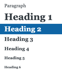
- Use headings and structure your content using HTML tags. Text should follow a hierarchy, with headings and subheadings (using HTML header tags) so that the correct sequence for reading content is clear.
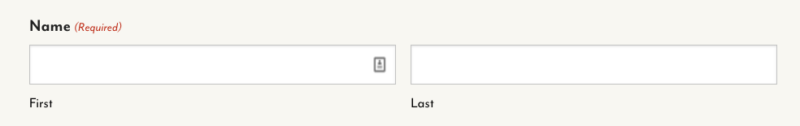
- Clearly label form fields. Don’t put your field labels inside of the field itself. Provide instructions for what information goes in the field and what format is acceptable, if needed.
3. Distinguishable: Users can see and hear content.
- Make text clearly distinguishable from the background. Be very careful with text that appears overlaying images or videos, as it can lack the necessary contrast. Also, white text on a colored background often does not have enough contrast for all users. Consider alternative layouts to maximize readability.

- Don’t rely exclusively on color to provide critical information or instructions. There are several Chrome extensions that simulate what your website looks like to users with different types of color blindness.
- Provide a way to pause, stop, and control the volume of audio elements.
- Ensure text can be resized by assistive technology without any issues.
4. Operable: The user interface and navigation are easy to operate.
- All functionality must be available from a keyboard. Ensure that users can use keyboard commands to navigate through your site, submit forms and perform other tasks.
- Provide controls for automatically advancing content. If you use a carousel, slideshow or other “auto-advancing” content, give users a way to pause, stop or override it. For example, make sure your carousel allows the user to move between slides manually.
5. Navigable: Users can navigate, find content, and determine their location.
- Give each page an accurate title and description. Write a meta title and meta description for each page, which is usually editable in your content management system (CMS). Include the topic or purpose of each page.
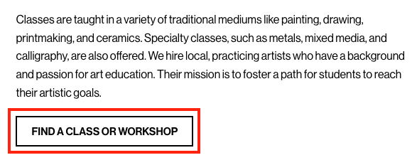
- Use descriptive link text. Avoid using terms like “more” or “click here” for your text links, as they don’t provide helpful information about what the user is going to find if they click that link. Instead, use text that tells the visitor exactly where the link will take them, such as “view current exhibitions” or “see all upcoming events.”
- Include a search function. A search tool can be a helpful shortcut for quickly getting visitors to information they’re looking for.
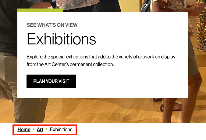
- Use breadcrumbs. Breadcrumbs are a navigation aid that show users what page they’re on, in relation to the other pages in the sitemap, or the pages they previously visited.
- Check the size of buttons and other clickable elements. Buttons and clickable components should be at least 44×44 pixels so that a visitor can easily select them (with a mouse, finger, or other tool).
- Provide a site map. A site map is like a table of contents that allows visitors to see the overall structure of the website. It can provide an alternate way for visitors to access information.
6. Understandable: Content and user interfaces are able to be easily understood.
- Use clear and simple language. Avoid using technical or academic language that can be difficult for visitors to understand. Think about how you can simplify and shorten your content or use more basic terminology without losing the meaning. Explain abbreviations.
7. Predictable: Pages and interface elements operate in predictable ways.
- Use consistent navigation. Your navigation should be the same across all pages, and components have the same functionality every time they appear. For example, if you’ve used an icon to signal that a button is a dropdown, use that same icons in every instance.
While web accessibility is not always easy, it is imperative to ensure full public access. It’s the right thing to do, and accessibility is now a legal requirement in many areas. Plus, it expands your ability to reach new and diverse audiences.