Designing and developing an effective museum website starts with clearly understanding your website visitors. If you don’t know who your visitors are or what they need, your website has no chance of being a useful tool for increasing ticket sales, reaching more people, or achieving your other marketing objectives.
While there are many strategies for understanding your website audience, Google Analytics is a handy tool that most museums probably already have at their fingertips.
As useful as Google Analytics is, it can also be overwhelming to make sense of all the data you have access to. For that reason, let’s focus on just two datasets as a starting point for learning about your website visitors.
Google Analytics Metrics for Understanding Your Museum Website Visitors
Referrals
Referrals tell you what other sites your visitors are coming from. You can see how many users were “referred” from another website, which lets you peek into their journey to discovering you. Knowing where a visitor came from is helpful for figuring out what they might be looking for now that they have arrived on your site.
You can access your referral traffic data by clicking Acquisition > All Traffic > Referrals in the sidebar menu. (Subject to change, of course, because Google changes this menu all the time.)
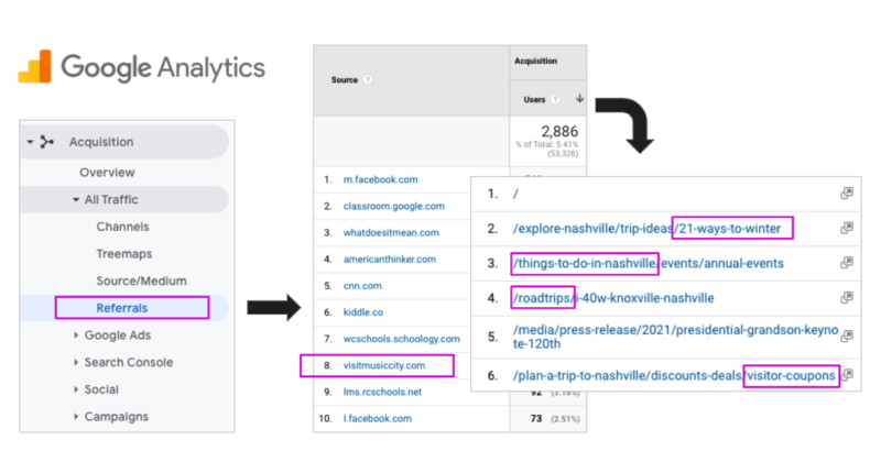
On the above example, I can see that this museum has visitors every month coming from a local tourism site. If I click on that URL, I can see that visitors from the tourism site had been looking at blog posts about winter trip ideas, road trips, and local coupons. All of those give me ideas for things this museum could incorporate into their overall digital marketing strategy, such as:
- Introduce coupons to help nudge people toward purchasing online tickets. Make sure the website checkout process can accept and process coupons easily.
- Write a blog post about local activities for each season (including the museum).
- Create an infographic with seasonal activities or travel tips that relate to the museum.
- Add a website landing page for a winter-friendly way to enjoy the museum in-person or at home. Optimize it for keywords related to the topic.
2. Affinity Categories & In-Market Segments
Another really interesting data point that your analytics can provide are Affinity Categories and In-Market Segments. These are groupings that Google has made up to put visitors with similar interests together, so that you can see how they interact with your site and other advertising campaigns.
Currently, you access your categories and segment data by clicking Audience > Interests > Affinity Categories or In-Market Segments in the sidebar menu.
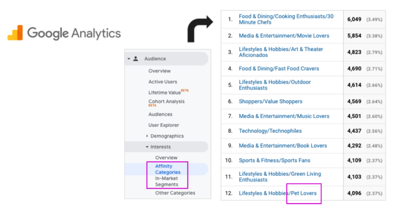
On this example above, the “Pet Lovers” category jumped out at me. This means the museum has people that Google classifies as pet lovers visiting the website in pretty large numbers. With this knowledge, the museum could take lots of steps to ensure that they are appealing to pet lovers who might be planning a visit to the museum. For instance:
- Is the museum website making it clear that dogs on a leash are welcome on the property?
- If someone searches the site for information about the pet policy, can they find an answer quickly?
- Could the museum host a “Bring Your Pet” event and promote it on the website and social media?
This is a great section to browse in Google Analytics to get your creative juices flowing as you think about ways to optimize your museum website.